I was asked to work in a Senior Designer capacity on a rebrand of the BBC's Skillswise site - which provides Level 3 and Level 1 resources and learning materials to teachers and tutors.
I worked alongside Senior Producers, Technical Product Managers and with a group of passionate users.
I worked alongside Senior Producers, Technical Product Managers and with a group of passionate users.
Project background
The existing Skillswise site had been part of BBC Learning's suite of sites for years. It had good traffic, a base of passionate users that were keen to be involved in the planning of new resources, and were constantly singing the sites praises - providing Teachers and Tutors with resources that they could easily print out and give to students to complete.
As part of a global optimisation of the BBC's sites, older sites that used the BBC's Barley layout, were either being mothballed and no longer updated, or moved to the new, wider Barlesque templates.
There was no budget for new content, but there were hundreds of resources already on the site that were hard to find in the old site search and navigation. The site itself was also looking tired and old.
I discussed a possible redesign and refresh of the brand with the team, while at the same time, making some general UX improvements to the site - to bring some of the older resources to the fore, improve the findability of subject specific resources and keep the site feeling fresh.
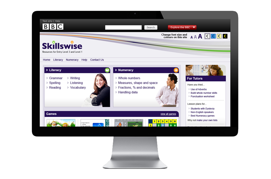
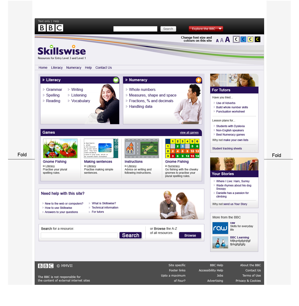
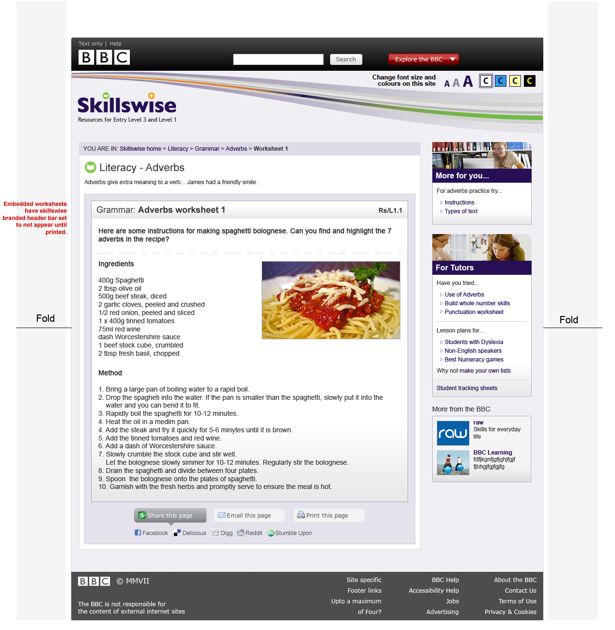
The Existing Skillswise site - the design hadn't been updated in years
Branding and visual identity
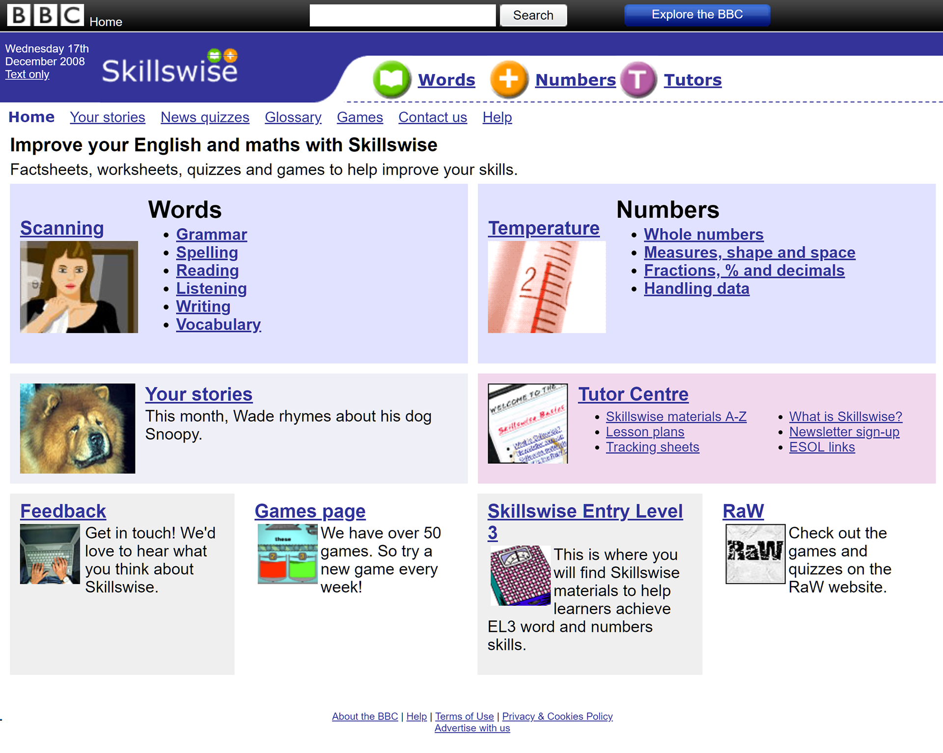
As well as improving the user experience of the site and functionality, we also needed to change the site's layout to a new wider BBC Barlesque format.
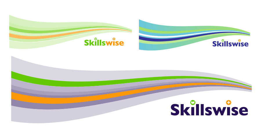
The much loved Skillswise brand, looked a little tired and lacked impact. The rich dark purple used on the Skillswise site and use of orange and lime green, gave it a distinct identity and so I decided to try and use the same colours if I could, but in a new fresh way.
I experimented with different fonts and styles. Since the BBC no longer had the original logo artwork files, I redrew the 'book' and 'plus' icons using Illustrator - I'd noticed that when the old logo was used at small sizes on printed worksheets and across other areas, the icons had a habit of becoming hard to determine and a little muddy, with the orange and green circles almost merging into one another.
As well as improving the user experience of the site and functionality, we also needed to change the site's layout to a new wider BBC Barlesque format.
The much loved Skillswise brand, looked a little tired and lacked impact. The rich dark purple used on the Skillswise site and use of orange and lime green, gave it a distinct identity and so I decided to try and use the same colours if I could, but in a new fresh way.
I experimented with different fonts and styles. Since the BBC no longer had the original logo artwork files, I redrew the 'book' and 'plus' icons using Illustrator - I'd noticed that when the old logo was used at small sizes on printed worksheets and across other areas, the icons had a habit of becoming hard to determine and a little muddy, with the orange and green circles almost merging into one another.
I redrew the icons with clearer edges, so that they were less likely to distort at smaller sizes and experimented with moving them apart from each other.
The clear winner was a version using the font "Gill Sans Ultra Bold" - which afforded us the space to use the 'book' and 'plus' icons in place of the dot above the i.
The clear winner was a version using the font "Gill Sans Ultra Bold" - which afforded us the space to use the 'book' and 'plus' icons in place of the dot above the i.
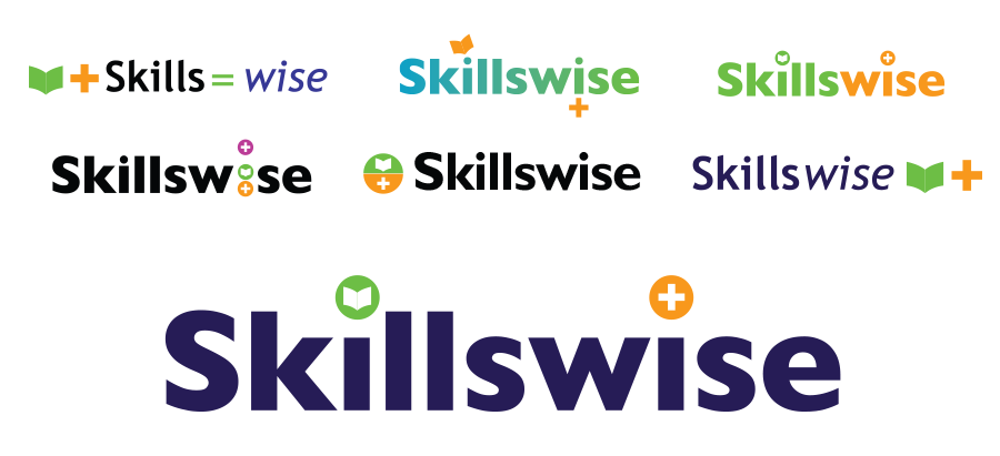
Experiments with the Skillswise logo and 'book' and 'plus' sign devices
I ideally wanted to bring the colours from the original site (and the logo), into the main design of the site. I experimented with the softer lavender shades of the dark purple logo, and incorporated the lime green and orange colours into the site header. So that it wouldn't be too much of a departure from the original site.
Wireframes and final designs
Once the look and feel had been decided on, I started tackling the various pain-points of our focus group.
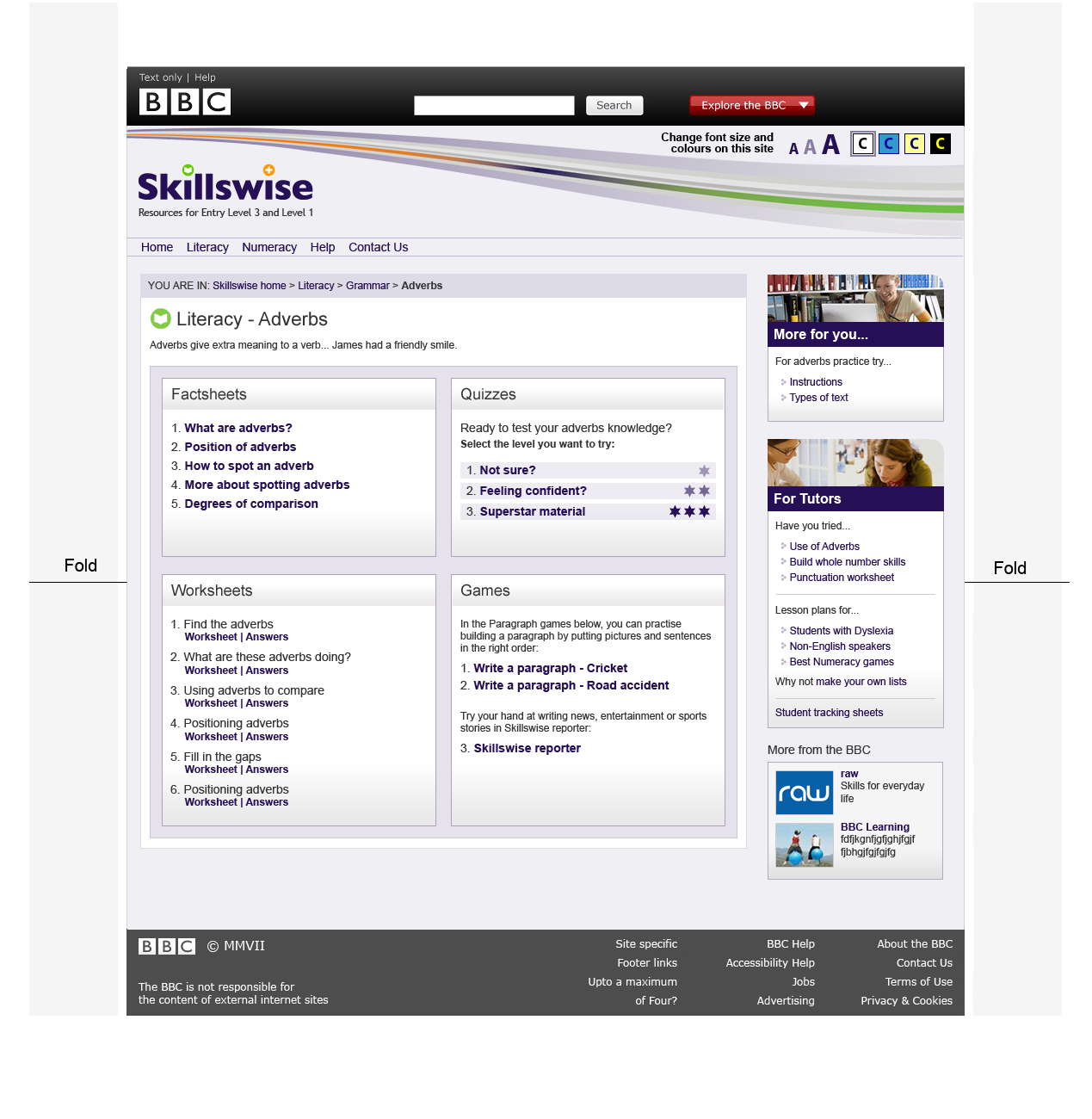
The existing worksheets opened in new windows and could not be bookmarked, so the first step was to get the flat, printable worksheets converted to html, so that they could be pulled into the main site. We asked an external agency to do this for us.
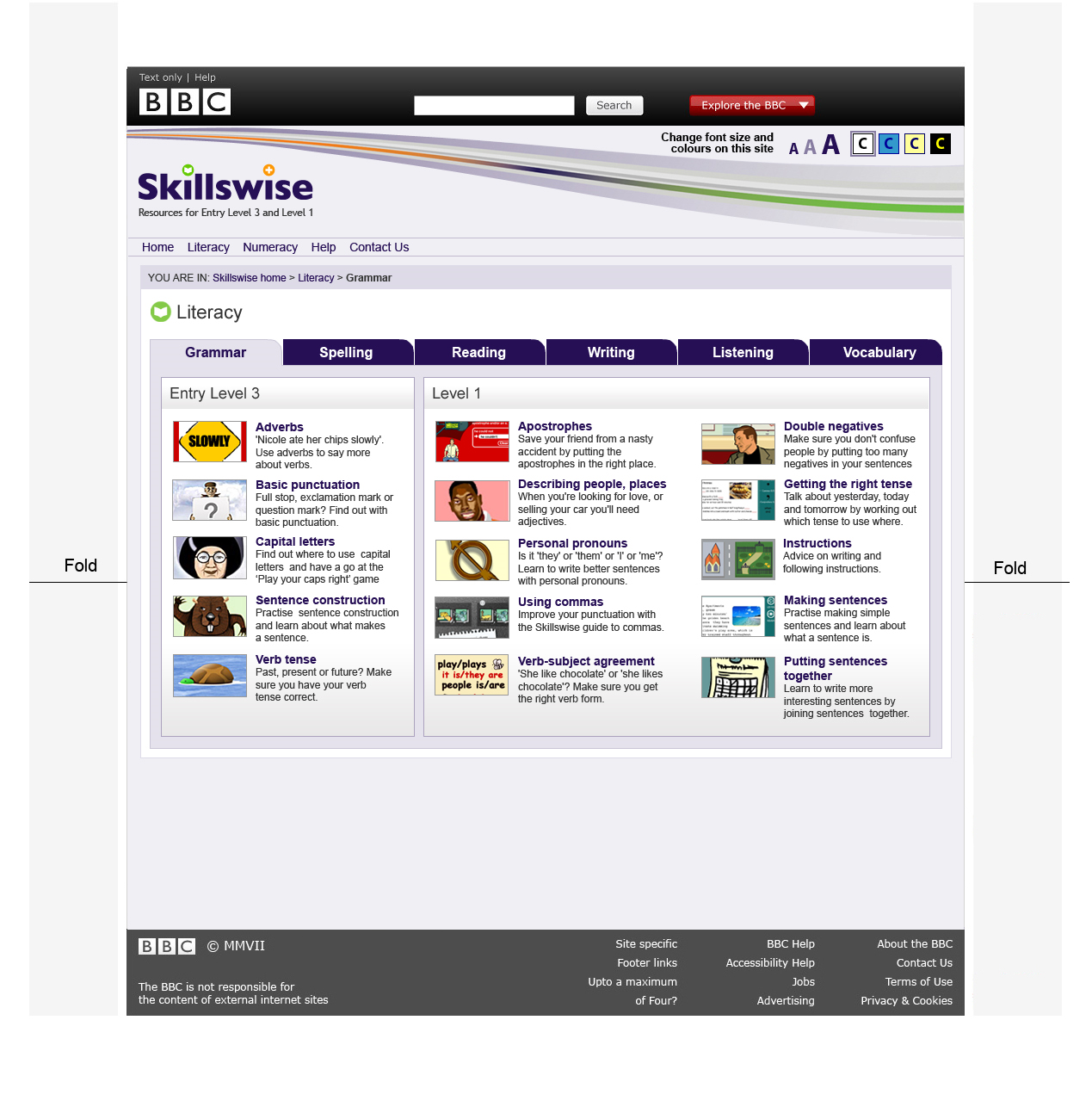
The work we'd done earlier in the focus group with the tutors - where we'd performed a card sorting exercise, had produced some ideas for how we might reorder content on the site and improve the IA. So I had a clear structure for how subjects, topics and modules would appear.
I also added the curriculum reference to the module page templates, so that tutors would be able to search on this as well as the subject names - increasing findability.
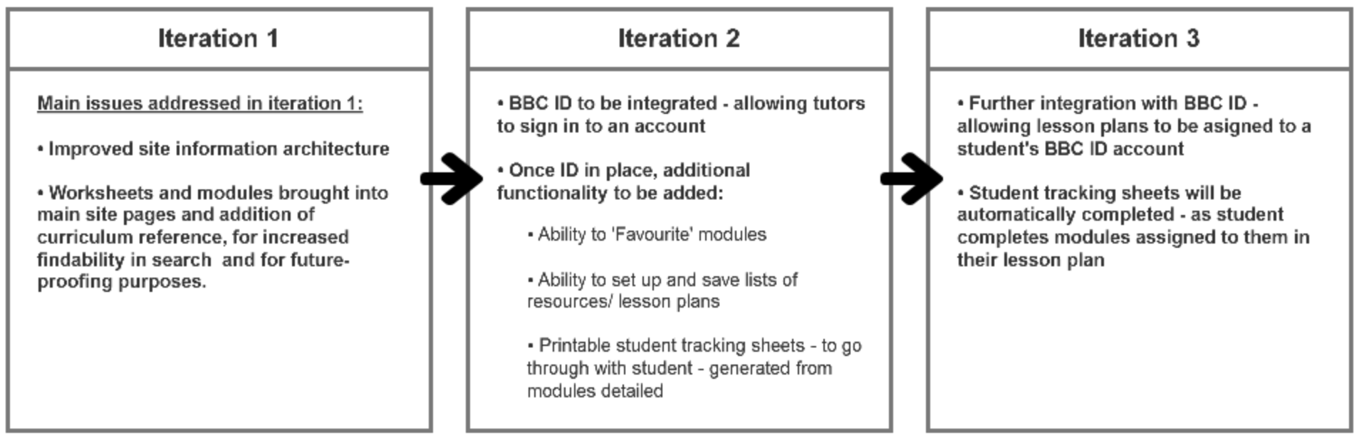
Since there was no budget for new content, and existing content needed to be converted, some changes had to be sacrificed in the first iteration, to fund conversion of the existing resources for use on the new site.
Wireframes were produced for iteration 2 of the site - including the ability to both 'favourite' modules and add them to a subject plan. Which I roughly prototyped in powerpoint and handed over to the developers.
Iteration 3 included further integration with BBC ID - allowing the tutors to also assign tasks to the students online, with the student progress sheet being automatically updated as a student completed each module.
Once the look and feel had been decided on, I started tackling the various pain-points of our focus group.
The existing worksheets opened in new windows and could not be bookmarked, so the first step was to get the flat, printable worksheets converted to html, so that they could be pulled into the main site. We asked an external agency to do this for us.
The work we'd done earlier in the focus group with the tutors - where we'd performed a card sorting exercise, had produced some ideas for how we might reorder content on the site and improve the IA. So I had a clear structure for how subjects, topics and modules would appear.
I also added the curriculum reference to the module page templates, so that tutors would be able to search on this as well as the subject names - increasing findability.
Since there was no budget for new content, and existing content needed to be converted, some changes had to be sacrificed in the first iteration, to fund conversion of the existing resources for use on the new site.
Wireframes were produced for iteration 2 of the site - including the ability to both 'favourite' modules and add them to a subject plan. Which I roughly prototyped in powerpoint and handed over to the developers.
Iteration 3 included further integration with BBC ID - allowing the tutors to also assign tasks to the students online, with the student progress sheet being automatically updated as a student completed each module.