I created a new logo and identity for the Naze Protection Society - a registered charity, as a well as designs for a wide range of promotional materials, including: flyers, business cards, collection boxes, display boards, QR enabled maps, and educational resources, plus merchandise such as badges, keyrings, web and mobile sites, plus social media channel setup, branding and content. I also ran and setup online surveys that were distributed via leaflet and social media.
Background
The Naze Protection Society (NPS) had been going for a number of years and had been set up to help raise funds to fight the rapid erosion of the Naze which threatens the Naze Tower and wildlife. Their last major campaign saw them raise and attract £1.2million of funding, to help secure the future of Walton's historic Naze. The project saw a 110m long rock structure (Crag Walk) installed, which provides an educational and public access viewing platform at the southern end of the Naze cliff, which helped to slow down the erosion.
However, erosion has recently continued at a much faster rate than previously calculated, and the historic Naze Tower is now dangerously close to the edge of the cliffs. So the NPS decided it was time to make the society more active again, to raise funds to extend the Crag Walk.
I had been recommended to the society through my campaigning work with another local cause - SOS Walton (Save our Spaces), as someone who might be able to help them - their previous website had expired, the society had no social media presence, and the party were actively recruiting new members to swell their numbers and help aid them in their campaigning. I said "yes" immediately!
Research, Analysis and the brief
I started joining the regular meetings over Zoom, to learn more about the society and what they were trying to do. During the call, the members mentioned that they felt they needed a new logo, and a more up-to-date image, plus a website and social media pages. I told them that this was something I could definitely help them with. I worked together with the group, establishing what they felt were the most important issues and threats , and what their vision was for the charity, and what their future campaigning was likely to be.
The next step was setting up a survey to find out what locals, and visitors already knew (or didn't know), about the erosion of the Naze, and what issues were important to them. Once set-up, I shared this on several local Facebook groups within the Tendring Council district, and also in the holiday home owners networks and 'local memories' pages and groups, to ensure we reached the majority of people who would have an interest in the area. The early results would help to inform our intial campaigning materials and the society's brand. Dummy pages were set up for all social media channels, but we didn't want to draw attention to these, as they currently didn't have any content, and also so that the society name didn't influence or bias the results of the survey, and questions like "Who do you think is responsible for preserving/maintaining the Naze?".
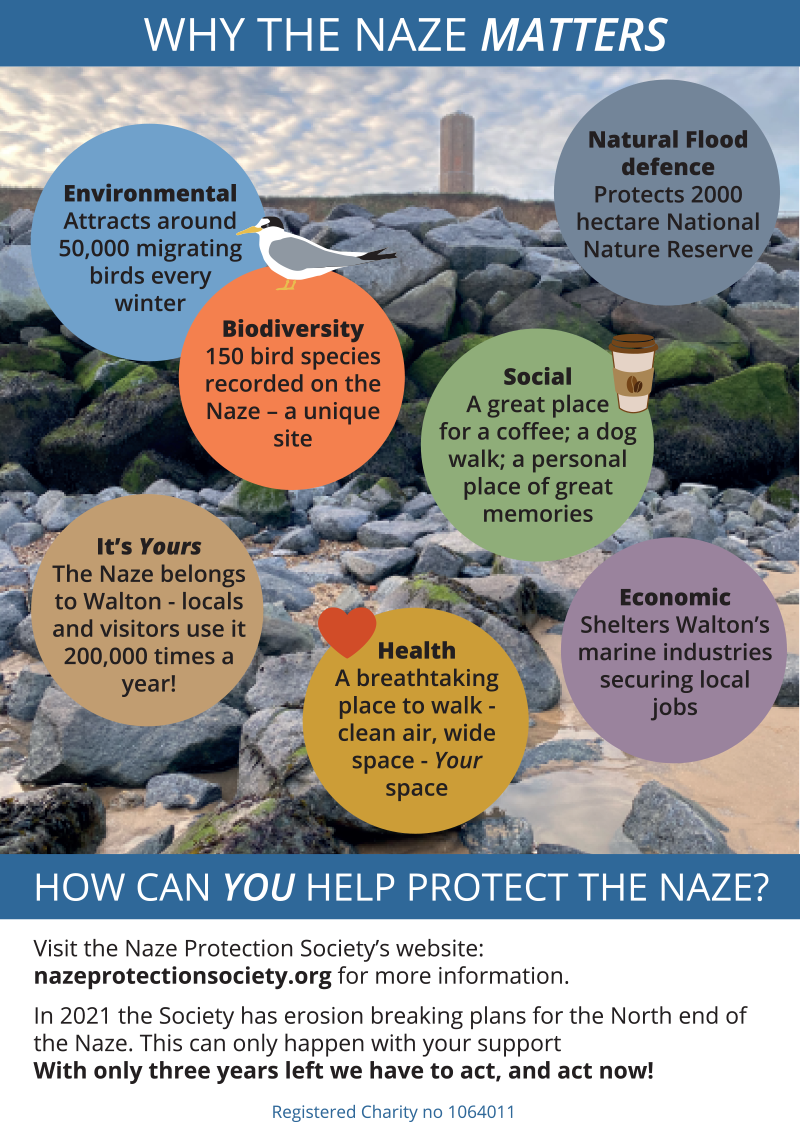
The intial survey results showed that the majority of locals and visitors (65%) were VERY aware of the issues and felt something needed to be done now, with 22% saying they had heard a few things about it, and were familiar with some of the key issues, there were very few people who had vaguely heard something about it, but couldn't remember the details (8%), or were not aware at all, of the issues (5%)
We also learned from the survey, that the key things that concerned people were: Loss of history (22%), loss of the beauty spot/nature reserve (17%), loss of the Naze tower (14%), acting fast (12%), wildlife/birds (9%), preservation of the town (7%)
The next step was setting up a survey to find out what locals, and visitors already knew (or didn't know), about the erosion of the Naze, and what issues were important to them. Once set-up, I shared this on several local Facebook groups within the Tendring Council district, and also in the holiday home owners networks and 'local memories' pages and groups, to ensure we reached the majority of people who would have an interest in the area. The early results would help to inform our intial campaigning materials and the society's brand. Dummy pages were set up for all social media channels, but we didn't want to draw attention to these, as they currently didn't have any content, and also so that the society name didn't influence or bias the results of the survey, and questions like "Who do you think is responsible for preserving/maintaining the Naze?".
The intial survey results showed that the majority of locals and visitors (65%) were VERY aware of the issues and felt something needed to be done now, with 22% saying they had heard a few things about it, and were familiar with some of the key issues, there were very few people who had vaguely heard something about it, but couldn't remember the details (8%), or were not aware at all, of the issues (5%)
We also learned from the survey, that the key things that concerned people were: Loss of history (22%), loss of the beauty spot/nature reserve (17%), loss of the Naze tower (14%), acting fast (12%), wildlife/birds (9%), preservation of the town (7%)


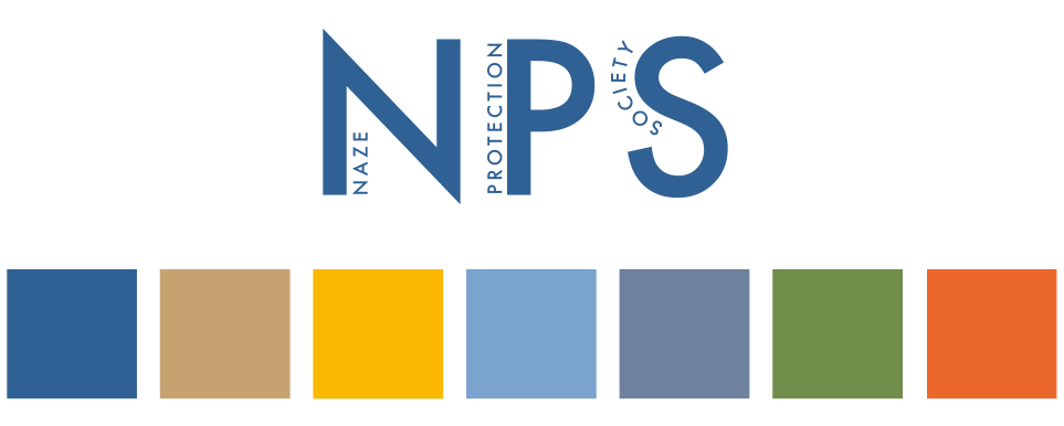
Logo and visual identity
A review of the local social media pages and groups usually gave a good indication of the things that locals and visitors are interested in (typically wildlife, collecting fossils, beach huts etc), but the Naze-specific survey helped us to focus on these things in relation to the Naze.
The Naze is a local tourism hotspot, with locals and visitors alike enjoying the wildlife reserve, walks, the WW2 pillboxes and Naze Tower, fossil-collecting, and seals. The main key-concerns we found people had in the survey were, preserving: history, the nature reserve, the Naze tower and wildlife/birds. There was also general concern about the rate of erosion and the need to act fast. The urgency can be tackled through messaging and strong photography, but the other elements could form part of the logo.
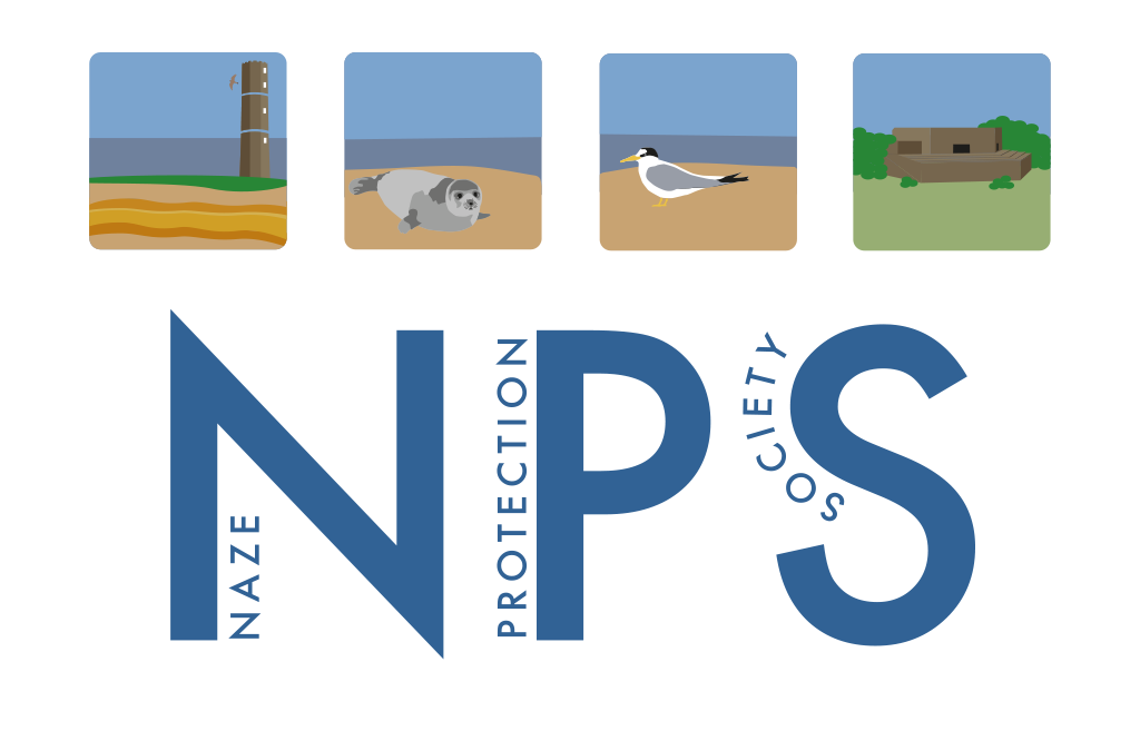
The Naze Protection Society are widely known locally by their acronym NPS - which featured in many of their past communications, so many locals already recognise them by this, but new people to the town and visitors will not be familar with this, so the logo still needed to feature the actual name of the society clearly.
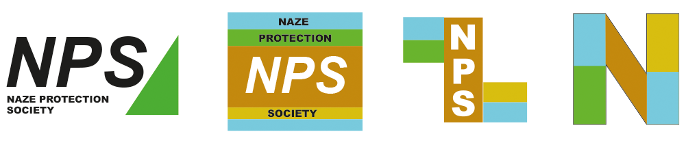
I started rough experimentation with colours and shapes, picking out colours from the local landscape and I also looked at the angles of the cliffs, and the different coloured layers that are revealed in the cliffs.
The Naze is a local tourism hotspot, with locals and visitors alike enjoying the wildlife reserve, walks, the WW2 pillboxes and Naze Tower, fossil-collecting, and seals. The main key-concerns we found people had in the survey were, preserving: history, the nature reserve, the Naze tower and wildlife/birds. There was also general concern about the rate of erosion and the need to act fast. The urgency can be tackled through messaging and strong photography, but the other elements could form part of the logo.
The Naze Protection Society are widely known locally by their acronym NPS - which featured in many of their past communications, so many locals already recognise them by this, but new people to the town and visitors will not be familar with this, so the logo still needed to feature the actual name of the society clearly.
I started rough experimentation with colours and shapes, picking out colours from the local landscape and I also looked at the angles of the cliffs, and the different coloured layers that are revealed in the cliffs.
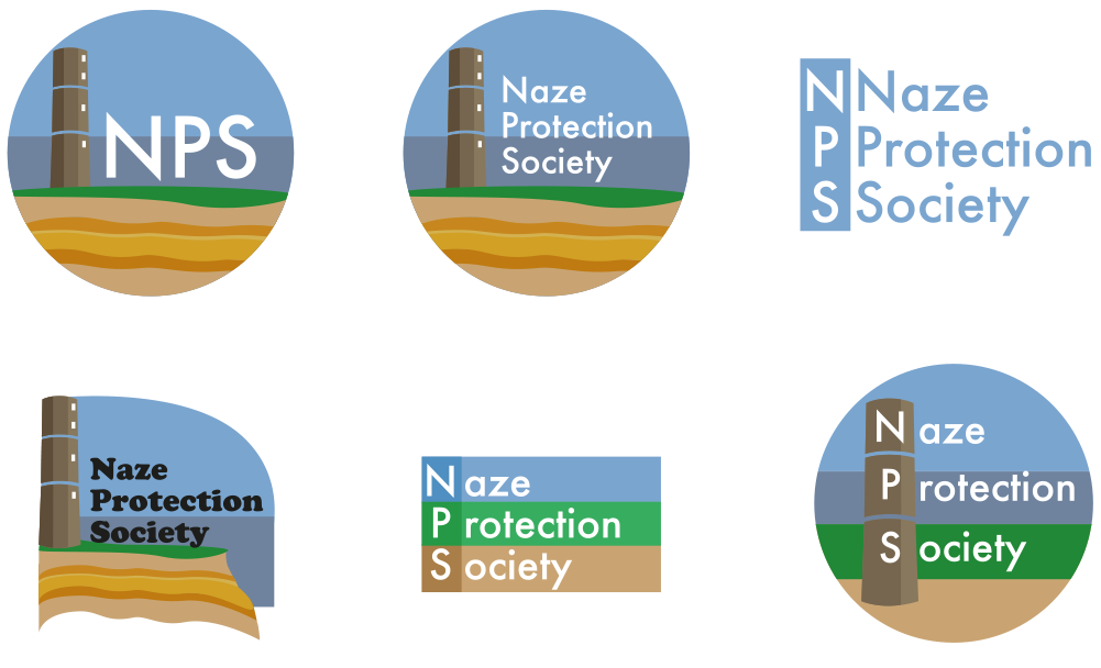
I knew the charity wanted the design to feel modern, and also something that people would want to buy merchandise for, so went back to some of the subjects of the popular facebook posts, while keeping the survey trends in mind. Heritage, wildlife/birds, and nature.
Railway poster style imagery is always a popular style for coastal resorts, and the current flat Scandi illustrative style is also quite popular at the moment. But Walton is also a traditional, fun seaside resort, hence the inclusion of the amusements-style Cooper Black font, in the early experiments.
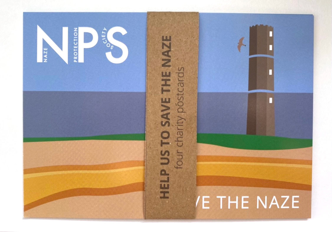
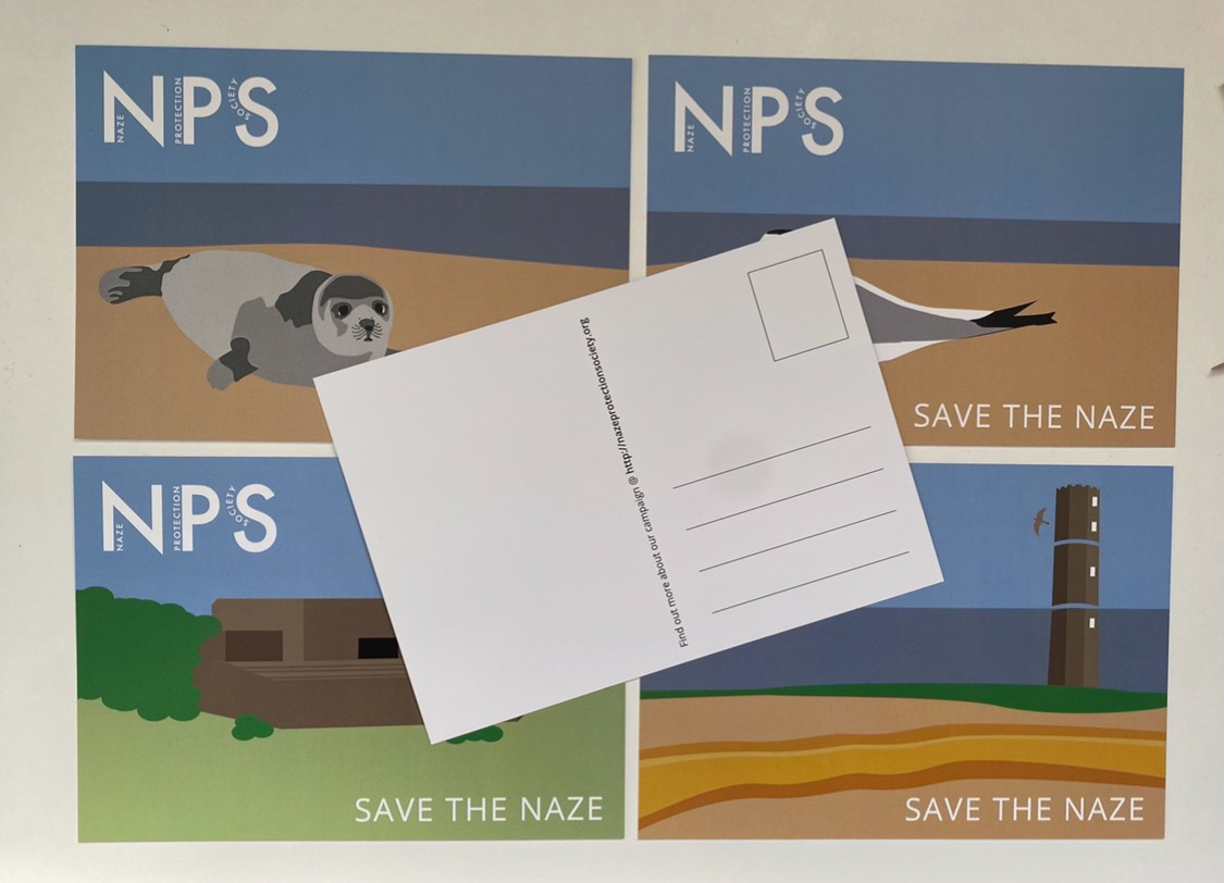
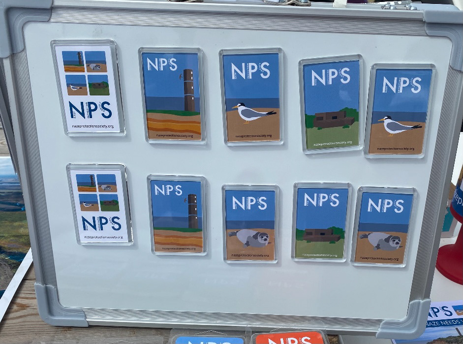
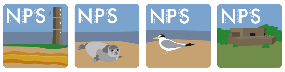
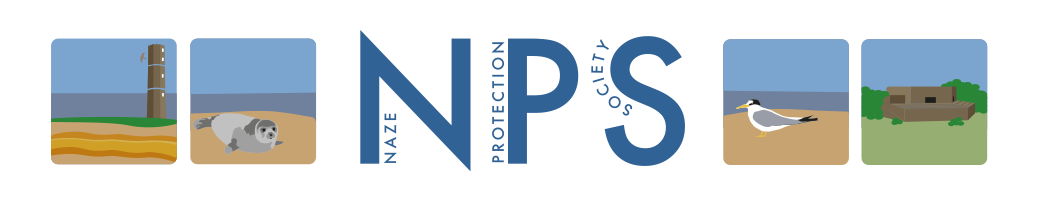
Because the Naze means different things to different people, there wasn't just one visual image or icon that could represent the society. Eventually I used a combination of the Naze Tower, A seal, A little tern, and an infantry pillbox, from the WW2 trail around the Naze. This set of images can be used together with the logotype, or seperately to target different audiences.
Railway poster style imagery is always a popular style for coastal resorts, and the current flat Scandi illustrative style is also quite popular at the moment. But Walton is also a traditional, fun seaside resort, hence the inclusion of the amusements-style Cooper Black font, in the early experiments.
Because the Naze means different things to different people, there wasn't just one visual image or icon that could represent the society. Eventually I used a combination of the Naze Tower, A seal, A little tern, and an infantry pillbox, from the WW2 trail around the Naze. This set of images can be used together with the logotype, or seperately to target different audiences.
Fundraising, and development of the brand
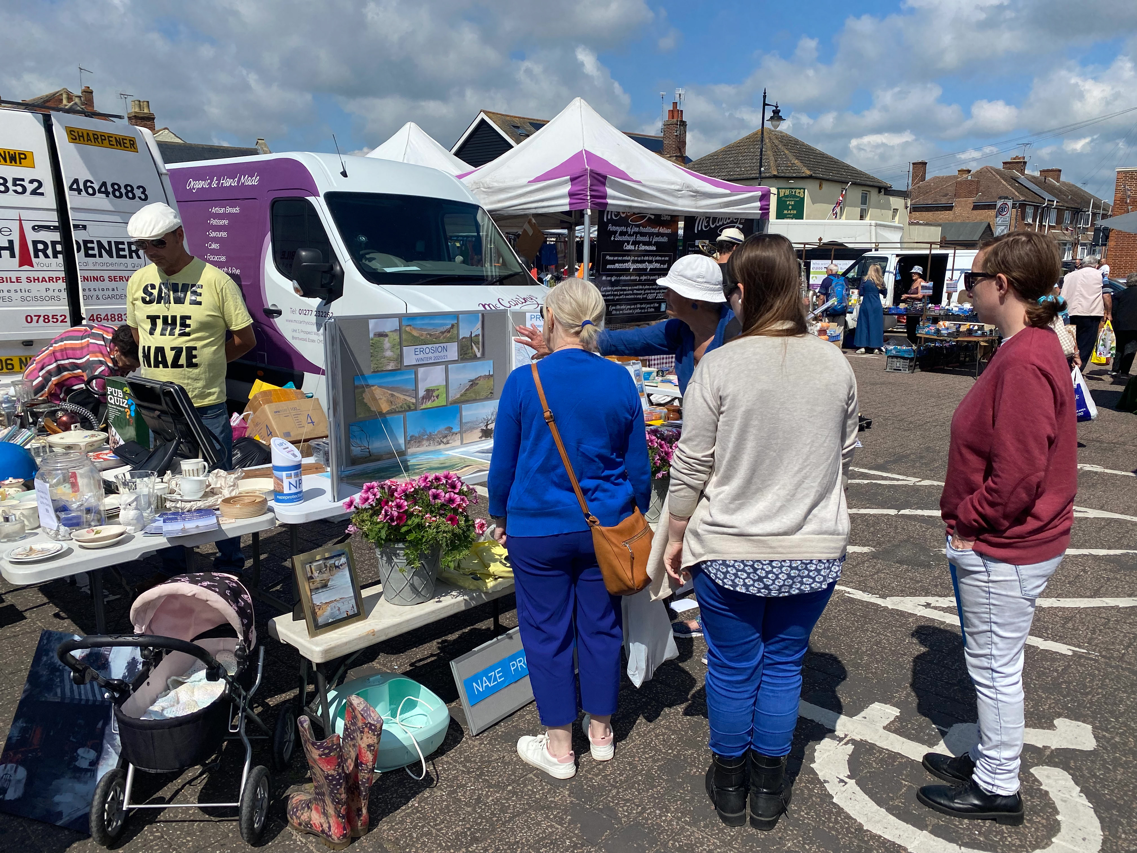
The society had previously successfully raised funds for the first installment of Crag Walk, this they had done by applying for local grants, running a branded charity shop in town, having stalls on the local market, and through articles in the local newspaper. They had also previously done a display on a removable board at local fetes and events showcasing the damage to the Naze that had occured over the years.
I realised there were lots of extra ways we could raise funds, through charity collection pages (Just Giving etc), renting a 'shelf' in a local shop to sell our branded merchandise during the Summer months, an online store to sell our branded merchandise (linked to our website), and an online co-branded store (Spreadshirt) for things like t-shirts and clothing (where it's impossible to stock the right combination of sizes etc).
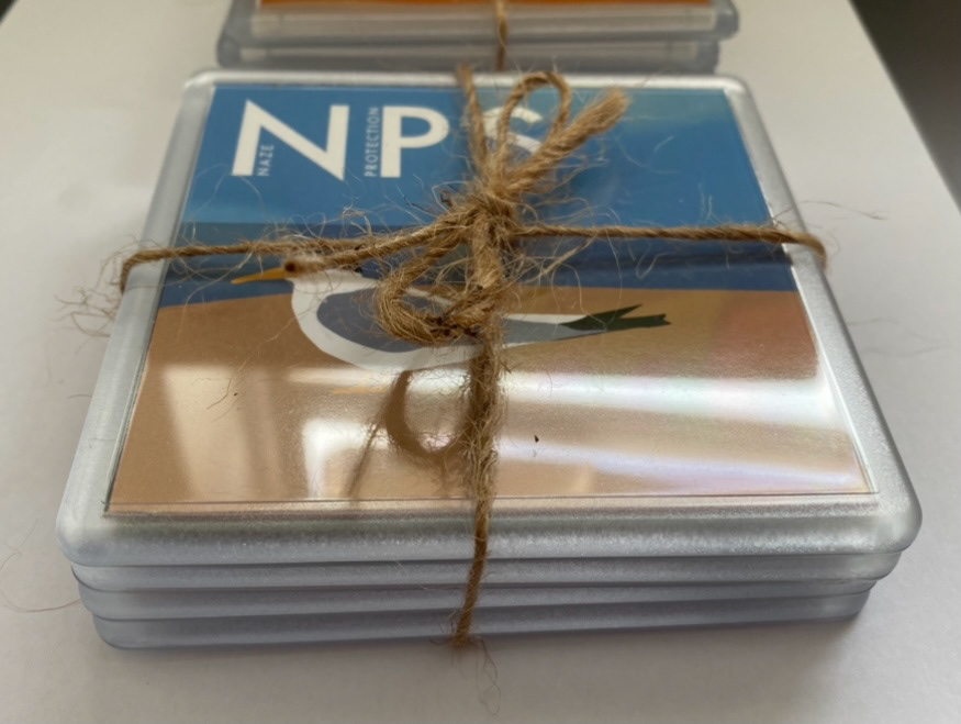
I looked at all the traditional typical items such as: badges, keyrings, fridge magnets, and coasters, that tourists love to buy, but the society realised that to attract a younger generation to care about the Naze, they also needed to do more.
I suggested an app, that allows you to explore the Naze in more detail, with links to a public google map to aid navigation to the major reference points. I also looked at getting promotional links into existing walking apps such as Go Jauntly, and even QR codes attached to printed maps of the Naze, and in children's activity packs, pointing out all the points of interest at the Naze, and linking to some secret videos on the YouTube channel, that I set up for the society. We have also been considering printed beer maps for the local pubs, once we return to something more normal in the post-Covid world.
I realised there were lots of extra ways we could raise funds, through charity collection pages (Just Giving etc), renting a 'shelf' in a local shop to sell our branded merchandise during the Summer months, an online store to sell our branded merchandise (linked to our website), and an online co-branded store (Spreadshirt) for things like t-shirts and clothing (where it's impossible to stock the right combination of sizes etc).
I looked at all the traditional typical items such as: badges, keyrings, fridge magnets, and coasters, that tourists love to buy, but the society realised that to attract a younger generation to care about the Naze, they also needed to do more.
I suggested an app, that allows you to explore the Naze in more detail, with links to a public google map to aid navigation to the major reference points. I also looked at getting promotional links into existing walking apps such as Go Jauntly, and even QR codes attached to printed maps of the Naze, and in children's activity packs, pointing out all the points of interest at the Naze, and linking to some secret videos on the YouTube channel, that I set up for the society. We have also been considering printed beer maps for the local pubs, once we return to something more normal in the post-Covid world.


Leaflets and merchandise from the campaign, and the weekly market stall.